
Autocomplete
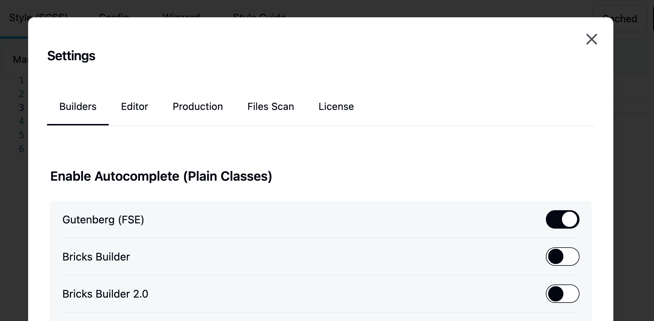
This feature is disabled. By default. You will need to enable it per builder.
Top bar > Settings > Enable Autocomplete > Builder
Learn more about autocomplete
Jump straight to a block's classes
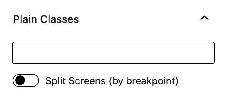
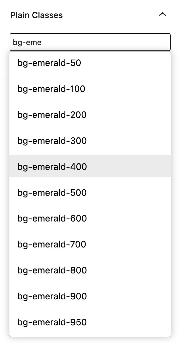
Hold ⌥ Option (Alt on Windows) and click a block on the canvas. The block is selected and the caret lands at the end of its Winden Classes field in the block settings, ready to type. A plain click works as before and keeps the caret in the canvas.
Compile on post save
The block editor always keeps the compiler and autocomplete available, and automatically recompiles output.css whenever you save a post or page. You no longer need to open Winden manually to recompile your CSS. This happens even with "Disable Dev Mode" turned on — that setting only controls whether logged-in visitors get the live compiler on the frontend. If a change happens outside the editor — content saved elsewhere, a menu or widget update, a scheduled post going live — Winden compiles it the next time you open the block editor or the Winden admin, or the next time an admin views the page on the frontend.
Load theme values
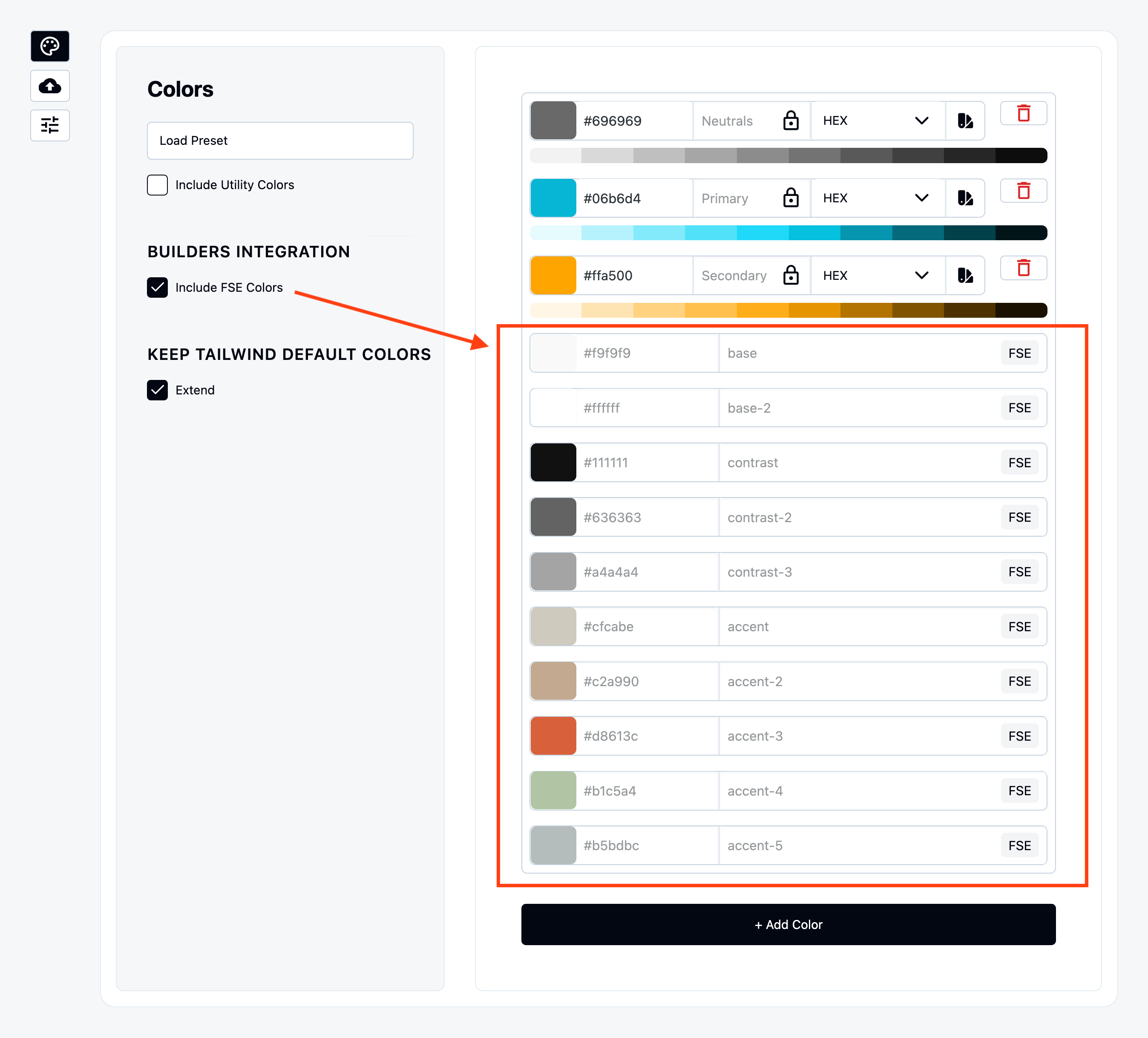
Colors
Once enabled it will be displayed as preview.
Breakpoints
Enabled it under “Include FSE Font Families” under Font Family tab.
Even gutenberg does not have breakpoints to set in Editor we have mapped their .scss that WordPress team use to style components.
You can find the list of breakpoints inside Gutenberg Trunk:
https://github.com/WordPress/gutenberg/blob/trunk/packages/base-styles/_breakpoints.scss
Font Family
Enabled it under “Include FSE Font Families” under Font Family tab.
Font Sizes
Enabled it under “Include FSE Sizes” under Font Sizes tab.
Space Sizes
Enabled it under “Include FSE Spacing” under Spaces tab.
Border Radius
Gutenberg does not have border radius values that we can include.
Inject Wizard values to theme
Winden Wizard stores smart values in database and those can be passed to Gutenberg Block themes.
You can enable it under
“Settings > Pass Wizard data to Builder and Theme > Gutenberg”
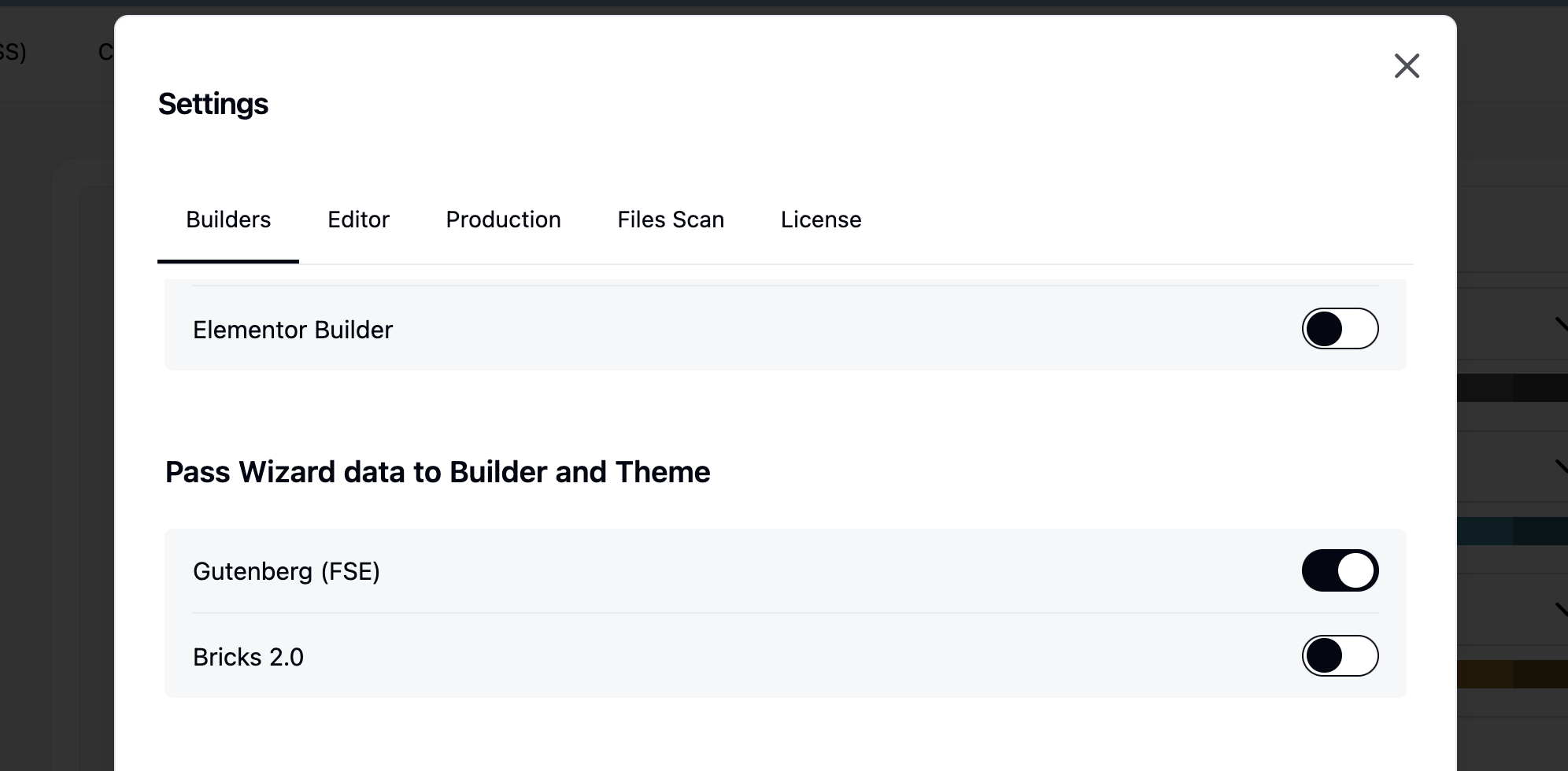
Once enabled, additional values become available in the Gutenberg block settings. These values function as global variables, meaning any updates made in the Wizard are propagated throughout the entire website.
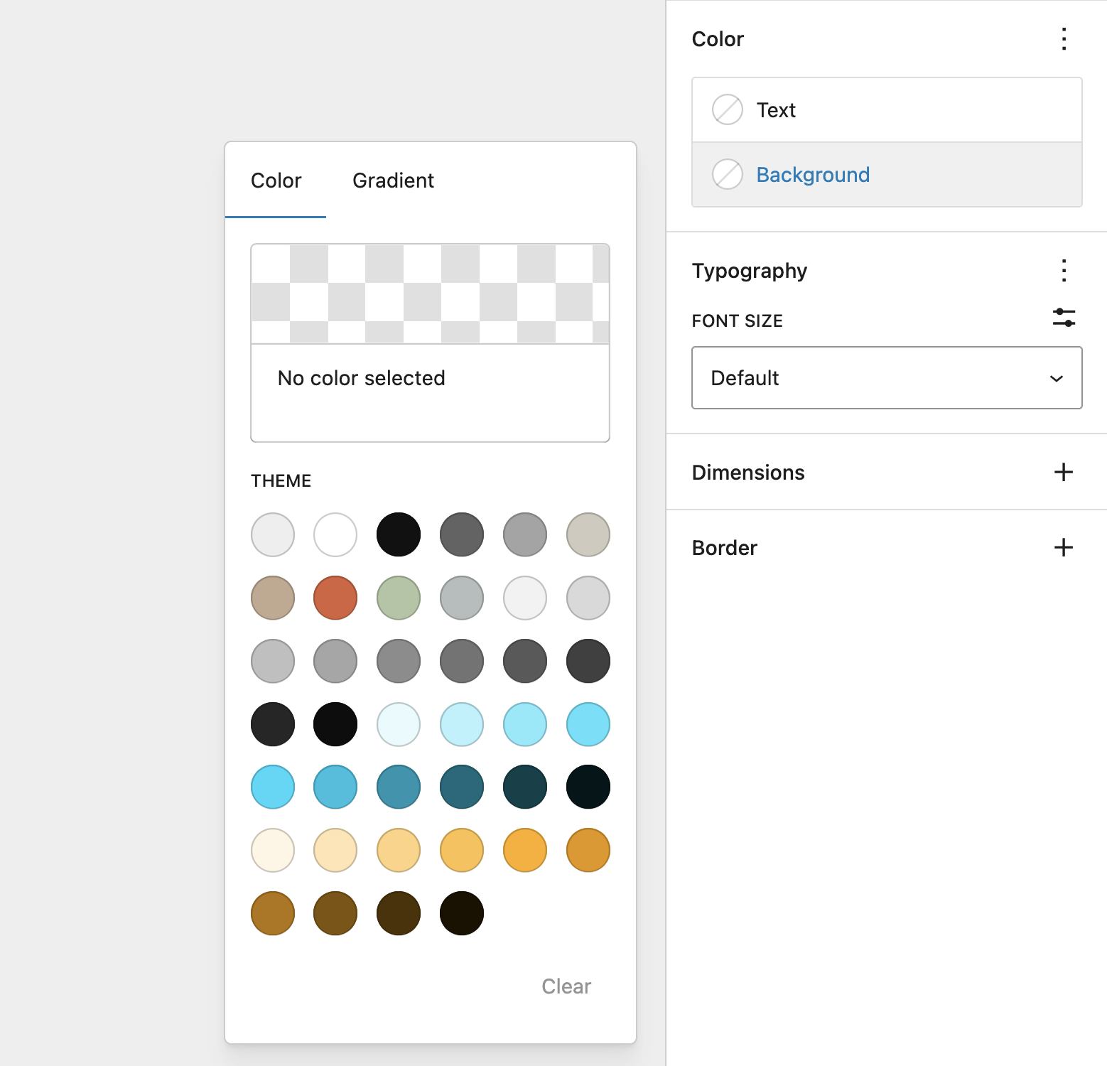
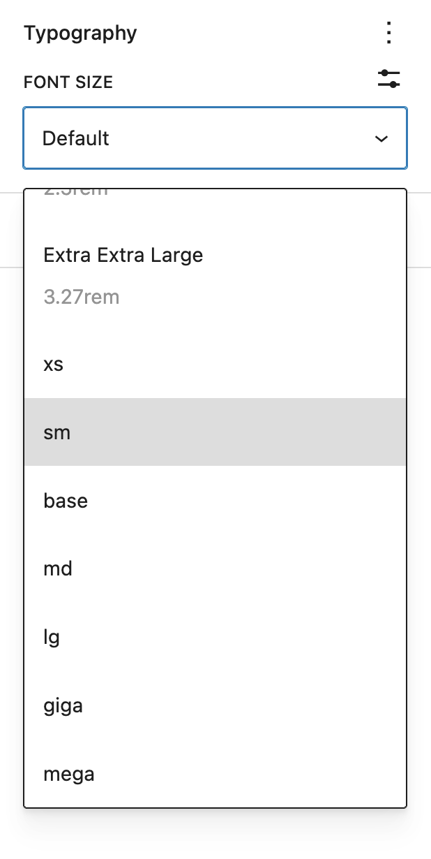
Values that are injected in the theme are:
- Colors
- Font Sizes
- Spacing (padding, Margins, Block Spacing)
Deregister styles experimental
egistering the default Gutenberg block styles may seem like a good idea in theory, but in practice it can negatively impact the editor experience. This happens because many of the styles used in the editor are tightly connected to the styles used for editing individual blocks. Removing them can therefore break or degrade parts of the Gutenberg interface.
Instead, we recommend using Tailwind’s @layer base or the Tailwind Preflight CSS to reset and standardize your defaults without removing essential block styles. This approach gives you a clean starting point while avoiding unexpected layout issues inside the editor.
@import "tailwindcss/preflight.css" layer(base);
The most effective workflow is to keep the core Gutenberg CSS and layer your theme styles on top of it. This allows you to reuse as many existing styles as possible, reduces duplicate work, and ensures a stable editing environment while still giving you full control over your design system.
Tailwind markup as blocks
Winden Classes puts a markup panel under the canvas — or beside it, if you prefer your code side by side with the page.
Open it with the Edit as HTML switch in the Winden Classes sidebar, from a block's < > toolbar button, with ⌃⌥H (⇧⌥H on Windows), from the command palette (⌘K), or from the Options menu (⋮).
The < > button in the top toolbar, beside List View, opens the whole page at once — and closes it again.
The panel starts closed every time you open a post: it is a keystroke away, and a code editor over the canvas is not what you want on a page you came to read.
While it is open, two buttons appear after that < >: dock the panel beside the canvas or under it.
Where it sits is remembered, and so is its size — its height under the canvas, its width beside it.
The shortcut is registered with WordPress, so it appears in the Keyboard Shortcuts list (⌘⇧/) and can be rebound there.
The panel shows the markup of whatever is selected, and follows the selection — so List View, the canvas and the code are all on screen together, and List View does the navigating. Selection works both ways: pick a block anywhere — a heading three groups deep included — and its own lines are marked in the code with the caret placed on them; move the caret through the code and the block is selected in List View and on the canvas. Changes reach the blocks when you stop typing or click away; the canvas updates in front of you. Drag the panel's top edge to resize it — its right edge, when it is beside the canvas.
Select several blocks and they go in together, coming back as blocks that replace all of them. Whole page edits every top-level block at once — the row List View does not have. Clear the editor there and the page is cleared with it; the editor stays open, and what you type next is inserted onto the empty page. For a single block, an emptied editor is treated as a rewrite in progress and the block stays until new markup replaces it.
Opening a whole branch in List View
List View opens one level at a time, so reaching a paragraph three groups down takes a click per level.
Every row with something inside it carries two buttons beside its ⋮: Expand all inside and Collapse all inside, which open or close the whole branch in one go.
The same two are in the ⋮ menu, and in the block's own toolbar menu on the canvas.
Images and galleries are real markup — a core Image is its <figure class="wp-block-image"> with the caption, size and link intact, and a Gallery keeps its columns and cropping.
A bare <figure><img></figure> pasted from a Tailwind library is still a group holding a Winden Image, with the classes on the image where you want them; the wp-block-image class is what tells the two apart.
A Group keeps its variation and its settings — a row justified to the centre comes back justified to the centre — and a table keeps its column spans, its header cells and its fixed layout.
One thing does not survive yet: padding, margins, colours and font sizes set through the block's own controls come back as a plain style attribute or a class instead.
They look the same on the page, but the block's controls no longer show them.
Blocks WordPress renders itself, such as Query Loop or Navigation, cannot be edited as markup: on their own the panel says so, and inside a larger selection they stand in the code under their own name (<core-query data-ref="0">) and come back untouched.
A block with nothing to show yet — a Winden Image before you have chosen a file — does the same, so it is never lost.
Paste a Tailwind component and it comes in as real blocks that keep every class.
Classes the editor's own CSS would overrule — absolute under the block wrapper's position, a heading size under the theme's h2 rule — get their ! automatically on the way in (absolute!), so you don't have to visit every block and press "use absolute!" yourself.
Responsive variants are checked too, at the width the canvas is showing: with the canvas wider than xl, an xl:-mb-8 the theme's block spacing beats gets its ! alongside the -mt-8 next to it.
Two additions make Tailwind components reproducible instead of falling back to Custom HTML:
Winden Image
A block that saves a bare <img> — no <figure> around it — so classes such as absolute inset-0 object-cover land on the image itself.
Pick a file, paste a URL, or turn on Use featured image to show the featured image of the post the block renders in.
Media library images keep srcset and lazy loading exactly like the core Image block.
Every <img> pasted through HTML to blocks becomes a Winden Image.
Winden Group and HTML attributes
Group, Paragraph, Heading, List, Quote, Separator, Code and Preformatted gain an HTML attributes control under Advanced.
Add aria-hidden, data-*, role, style or any other attribute and it is written onto the block's element as-is.
Event handlers (onclick and friends) are refused.
The Group block gets a Winden Group variation next to Row, Stack and Grid: a plain container with no layout of its own.
It really has none: a Winden Group carries no is-layout-flow class in the editor or on the page, so the theme's block spacing is not added between its children and the Tailwind classes decide every gap.
Its panel offers the HTML element (div, section, a, ul, li, dl, dt, dd, figure, span, details, … or Custom… for any tag) and the HTML attributes rows — style with a clip-path, aria-hidden, data-* — so a Tailwind component's markup is stored on the block, not lost.
HTML to blocks uses it automatically for markup a plain group cannot hold — the blurred clip-path gradient shapes in a Tailwind hero, for example — and keeps <dl>, <dt>, <dd>, <figure> and <blockquote> as the tags they are.
A pasted <blockquote class="text-xl text-white"> becomes a Winden Group rather than a Quote block, so the theme's quote border and padding stay off it; a Quote block's own <blockquote class="wp-block-quote"> still comes back as a Quote block.
A list whose items hold more than text — the feature list in a pricing card, each <li class="flex gap-x-3"> with a check icon — becomes a Winden Group <ul> of Winden Group <li>s with the icon as a Winden Icon inside, since a List block can only hold text and would drop the icon.
A list of plain sentences is still a List block.
Winden Shape
An element with nothing in it is a decoration: the blurred gradient blobs behind a hero, an overlay, a divider, a spacer. Pasting one selects the Winden Shape variation of the Group block, and its panel offers the same HTML element and attributes rows.
<div aria-hidden="true" class="aspect-1097/845 blur-3xl opacity-20" style="clip-path: polygon(74.1% 44.1%, 100% 61.6%)"></div>
An empty Group would show WordPress's "Group blocks together" card inside the shape, which is not what the classes draw. Marked as a shape, the element draws itself and nothing goes inside it.
Winden Text
An inline element standing on its own — a <time> beside the heading in a card, a <span> badge, a <code> token — becomes a Winden Text block: that element and nothing around it.
<time datetime="2022-10-10" class="order-2 block text-xs">10th Oct 2022</time>
The tag, datetime, and the classes all stay on the element.
Its panel offers the HTML element (span, time, code, abbr, mark, cite, kbd, … or Custom…) and the HTML attributes rows.
A <button>, <label>, <summary> or <legend> holding nothing but text becomes one too:
<button type="button" class="w-full rounded-md p-3 font-semibold">Read more</button>
The tag, the type and the classes stay where they were written.
A button with an icon beside its text is a Winden Group wearing the button tag instead — the icon is a block of its own inside it.
One holding a form control, or carrying an onclick, stays Custom HTML: the control is the reason that markup was written.
Wrapping it in a paragraph would have been simpler and loses layout: the <p> becomes the flex or grid item, so order-2, col-span-2 or self-start on the element would apply to a box that is no longer the one being laid out.
Inline tags inside a sentence are untouched — they stay part of the text. Only an inline element standing where a block goes becomes one.
Winden Icon
An inline <svg> — the icon in every Tailwind component — becomes a Winden Icon block that keeps the markup exactly as written.
<svg class="size-6 text-indigo-600" fill="none" viewBox="0 0 24 24" stroke="currentColor" aria-hidden="true">
  <path stroke-linecap="round" d="M9 12.75 11.25 15 15 9.75" />
</svg>
The paths, the viewBox, fill, stroke and the classes all stay on the <svg> itself, with no wrapper around it — so size-6 and text-indigo-600 size and colour the icon, and it sits in a flex row as the markup intended.
Its panel shows the SVG so you can paste a different one, and the HTML attributes rows for everything on the element.
This is not WordPress's own Icon block: that one holds the name of an icon from WordPress's icon library, so it cannot show an icon set such as Heroicons or Lucide. Winden Icon holds the drawing.
Icons survive saving even for users who cannot post unfiltered HTML. Drawing elements and their attributes are allowed through; Script tags, foreignObject elements, links and event handlers in SVG are still stripped.
Links around blocks
A link holding blocks — <a href="/post"><h3 class="text-lg">How to position your furniture</h3></a>, the card link every component library is made of — becomes a Winden Group with its element set to a and the href in its HTML attributes.
The heading inside it stays a Heading block, with its own classes.
target, rel, aria-label, data-* and style come through with it.
Its children decide which it is. A link holding text stays text: a link inside a sentence stays inside the sentence, and a row of links stays a row. A link holding a heading, an image or a card is a wrapper, and becomes a group.
Turn any Winden Group into a link by setting its HTML element to a and adding an href attribute row.
Set the element back to div to undo it.
The block keeps its content, its classes and its place in the undo history either way.
Clicking inside a link on the canvas selects the block rather than following the link.
Choosing a Group variation in the markup
A Group's variation — Group, Row, Stack or Grid — is a setting, not markup, so a container written as HTML has no way to say which one it wants.
Write data-wp-layout on it and HTML to blocks builds that variation:
<div data-wp-layout="grid" class="gap-6">…</div>
<div data-wp-layout="row" class="gap-4">…</div>
<section data-wp-layout="stack">…</section>
<div data-wp-layout="constrained">…</div>
| Value | Variation |
|---|---|
constrained |
Group — content width from the theme |
row |
Row — flex, no wrap |
stack |
Stack — flex, vertical |
grid |
Grid |
The attribute is consumed, not written to the page — it sets the block's layout and disappears.
Editing the block as HTML again shows it, so the variation survives the round trip.
It also autocompletes: start typing an attribute inside a <div>, <section>, <article>, <header>, <footer>, <main>, <aside> or <nav> and data-wp-layout is offered alongside the standard ones, then the four values once you are inside the quotes.
Any part of the name matches, so lay finds it.
Leave it out and you get a Winden Group, which is usually what Tailwind markup wants.
Row, Stack and Grid switch on WordPress's own layout CSS — is-layout-flex, and a gap from the theme's block spacing — and that competes with the flex gap-4 already on the element.
Winden resolves the clash the same way it does anywhere else, by adding ! to the losing class (gap-4!), but the simpler result is to skip the attribute and let Tailwind do the layout.
Use it when you want the block's own controls — Grid's column count, Row's justification — rather than utilities.
Winden also lets clip-path and transform inline styles through the WordPress content filter, so users without unfiltered_html (Authors, all roles on multisite) keep those shapes on save.
Blocks written as a tag
Some blocks are not their markup.
A Columns block saves a <div class="wp-block-columns"> whose column widths hide in inline styles and whose every setting is a class WordPress writes at save time — read back as plain HTML it is nested groups, which is the right pixels and the wrong block.
Those blocks are written as a tag named after the block instead:
<core-columns class="gap-8" is-stacked-on-mobile="false">
  <core-column width="33.33%">
    <h2 class="text-2xl">Left</h2>
  </core-column>
  <core-column width="66.66%">
    <p>Right</p>
  </core-column>
</core-columns>
Open a Columns block with Edit as HTML and that is what you see, so the round trip is symmetric: everything the panel shows you, you can write back.
The block's settings are its attributes, written in kebab-case:
| In the markup | On the block |
|---|---|
class="gap-8" |
the block's classes |
id="pricing" |
the block's HTML anchor |
width="33.33%" |
the setting of that name |
is-stacked-on-mobile="false" |
false, not the text — the block reads it as off |
is-stacked-on-mobile |
on, the way HTML means a boolean |
data-wp-attrs='{"layout":{"type":"flex"}}' |
settings that are not a single value |
Buttons work the same way, and for the same reason — everything naming a Buttons block is a class WordPress generates:
<core-buttons class="flex gap-4">
  <core-button url="/signup" background-color="primary">Get started</core-button>
</core-buttons>
A block whose content is text rather than other blocks writes it between the tags, where you can read and edit it.
A Button's label is the case you will meet: type it where it appears.
The attribute spelling — <core-button text="Get started"> — still works, so markup written before this keeps building the same block.
Only what differs from the block's own defaults is written, so a Columns block straight from the inserter is just <core-columns>.
You do not have to remember any of this.
Type < and the blocks are offered alongside the ordinary HTML tags, matched anywhere in the name — col finds core-columns.
Pick one and it arrives with the children it would have come with from the inserter — Columns brings its two columns, Tabs brings its tab list and panels, Social Icons brings three links:
<core-columns>
  <core-column></core-column>
  <core-column></core-column>
</core-columns>
Tab walks the empty spots in reading order.
Type a space inside a block tag and its settings are offered, each one knowing what it takes: is-stacked-on-mobile offers true and false, align offers its five values, and data-wp-attrs is there for anything that is not a single value.
Every block is there, including your own and any plugin's — a Post Title, a Query Loop, a Social Icons block are all reachable from the keyboard.
Blocks that are their own markup are the exception: write <p>, <h2> and <img> rather than a tag for them.
The list says which kind each one is.
"a block, written as a tag" comes back as that same tag when you reopen the page.
"inserted as a block" is built from what you wrote and then handed back untouched as a marker (<core-post-title data-ref="3">) — nothing is lost, but the spelling changes once it exists.
<core-column> only builds a column inside <core-columns> — WordPress refuses it anywhere else — so written on its own it becomes a group and keeps its content.
Everything that is its markup stays markup: <h2>, <p>, <img>, and a <div> of Tailwind classes are unchanged.
Blocks WordPress renders itself still stand in the code under their own name with a data-ref and come back untouched.
Reach for a grid before you reach for Columns.
<div class="grid md:grid-cols-3 gap-8"> is columns with no WordPress layout CSS in the way, and a breakpoint of your choosing rather than one "stack on mobile" switch.
Columns is worth it when you want the block's own drag-to-resize handles, or a block a client will recognise later.