Wizard Mode (Auto-Calculated)
The wizard automatically calculates all font sizes based on mathematical ratios.
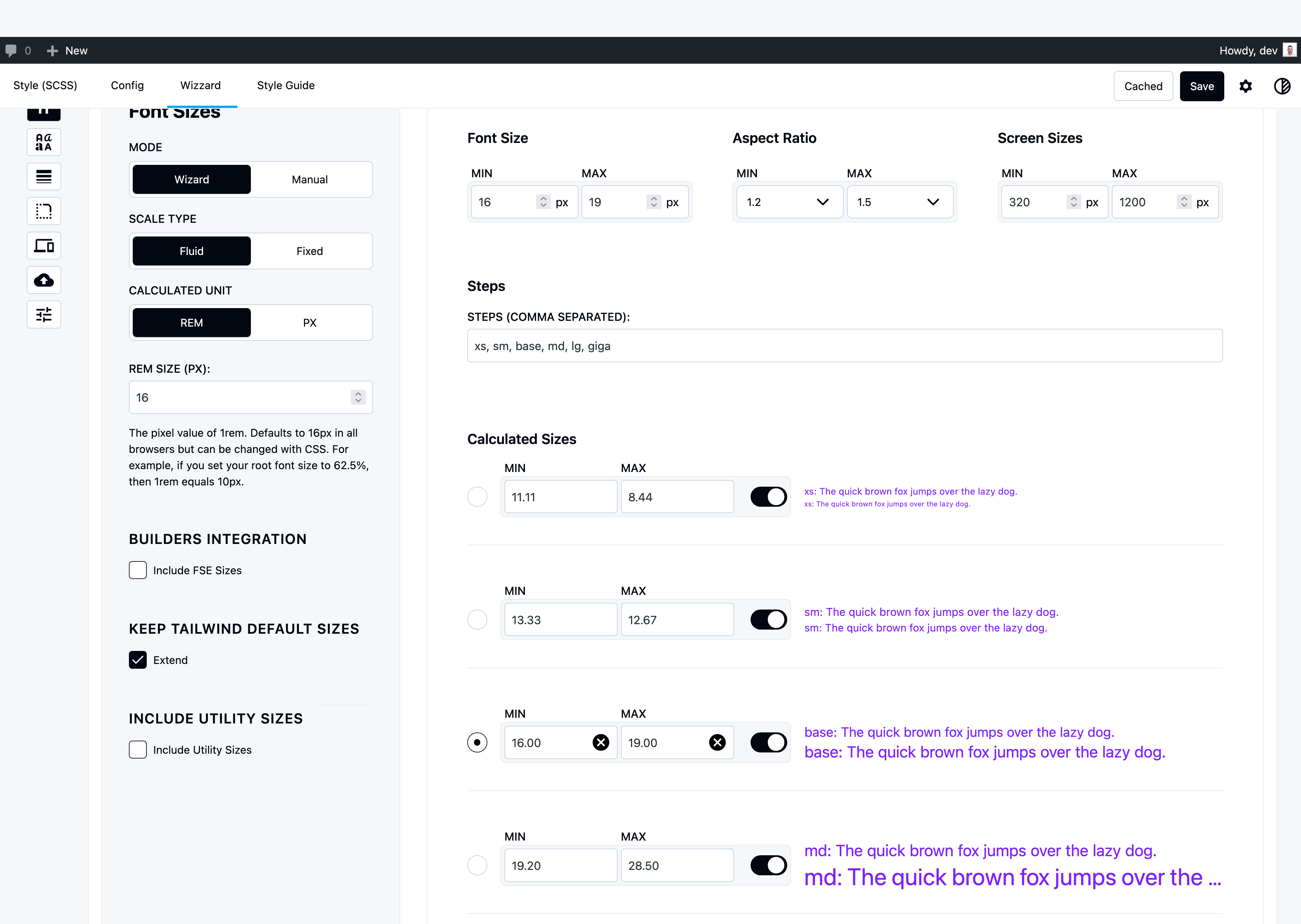
Min & Max Values
Base Font Size (Min & Max):
- Min: Font size at smallest viewport (e.g., 14px at 375px)
- Max: Font size at largest viewport (e.g., 16px at 1440px)
- Creates fluid scaling between viewports
Screen Sizes (Min & Max):
- Min: Smallest viewport (default: 375px mobile)
- Max: Largest viewport (default: 1440px desktop)
- Defines the range where font sizes scale
Aspect Ratio
Controls how font sizes grow between steps.
Common Ratios:
- 1.2 (Minor Third) – Balanced, recommended
- 1.25 (Major Third) – Moderate contrast
- 1.333 (Perfect Fourth) – Strong contrast
- 1.618 (Golden Ratio) – Natural, dramatic
Min vs Max Ratio:
- Min Ratio: Used at smallest viewport (tighter scale on mobile)
- Max Ratio: Used at largest viewport (looser scale on desktop)
- Ratio itself scales fluidly between viewports
Example:
Min Ratio: 1.2 (mobile)
Max Ratio: 1.333 (desktop)
Base: 16px

Mobile:  13.3px, 16px, 19.2px
Desktop: 12px, 16px, 21.3px
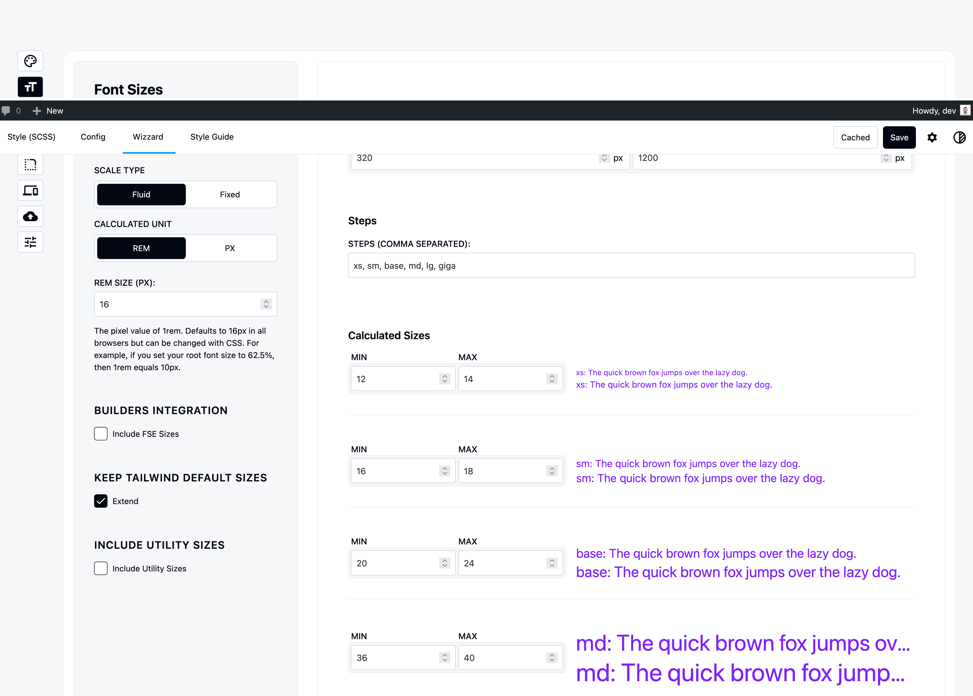
Steps
Number of Steps: How many font sizes in your scale (default: 9)
Base Step Position: Which step is your base font size (default: step 4)
How Steps Work:
- Steps below base = divided by ratio (smaller sizes)
- Steps above base = multiplied by ratio (larger sizes)
Example (9 steps, base at step 4):
Step 1: base / ratio³ = 11.6px  (xs)
Step 2: base / ratio² = 13.9px  (sm)
Step 3: base / ratio  = 16.7px  (base)
Step 4: base         = 20px     ← BASE
Step 5: base × ratio  = 24px    (lg)
Step 6: base × ratio² = 28.8px  (xl)
...
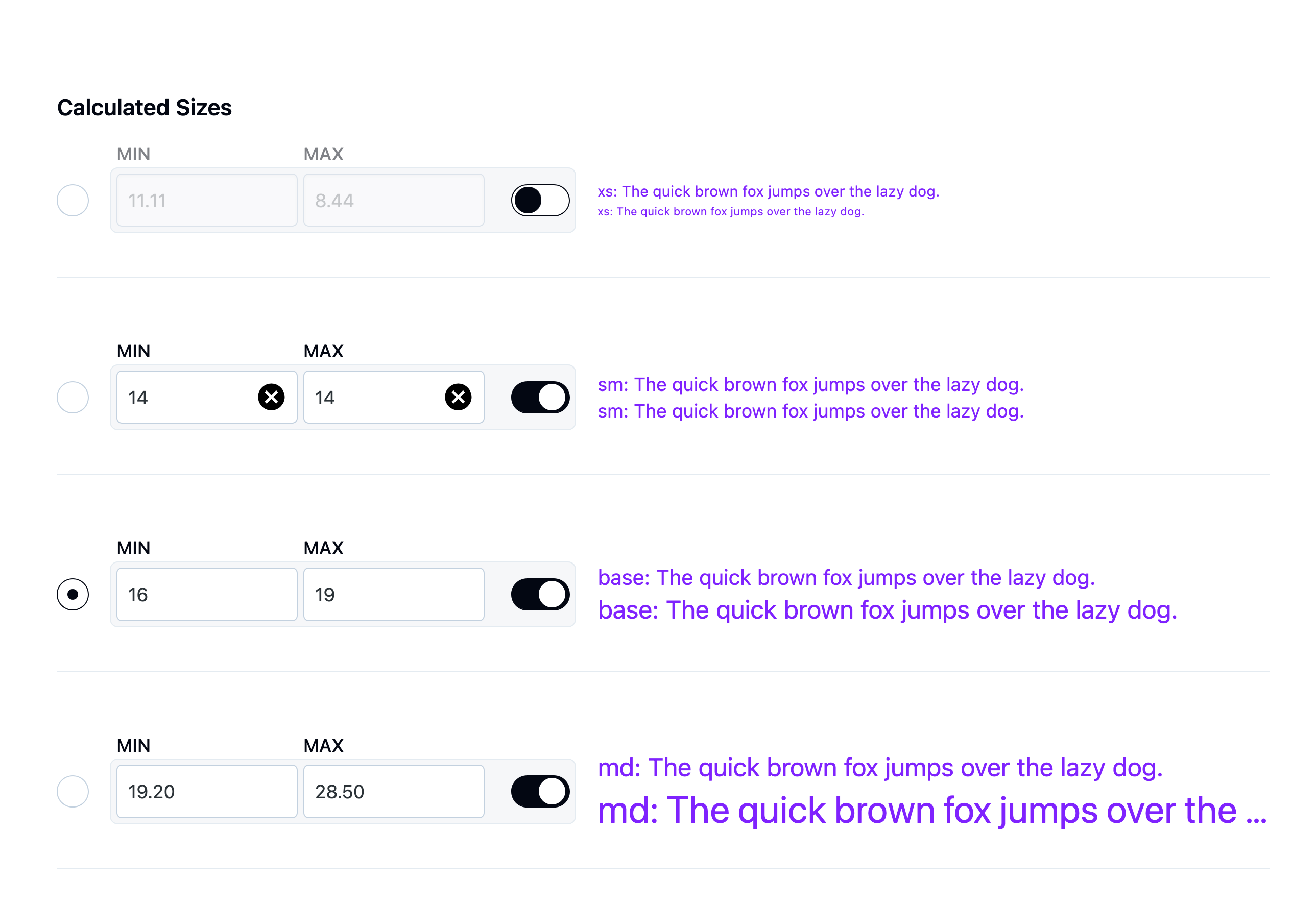
Calculated Sizes
The wizard generates all sizes automatically using fluid clamp():
@theme {
  --text-xs: clamp(0.694rem, 0.644rem + 0.25vw, 0.833rem);
  --text-sm: clamp(0.833rem, 0.773rem + 0.3vw, 1rem);
  --text-base: clamp(1rem, 0.928rem + 0.36vw, 1.2rem);
  --text-md: clamp(1.2rem, 1.113rem + 0.432vw, 1.44rem);
  --text-lg: clamp(1.44rem, 1.336rem + 0.518vw, 1.728rem);
}
Override Calculated Sizes
Don’t like an auto-generated size? Override it manually:
- Expand size settings
- Click on the size value
- Enter your exact value
- Other sizes remain calculated
Use case: Match exact brand guidelines while keeping mathematical scale.
Toggle Sizes On/Off
Disable unused sizes to prevent bloat:
- Expand size settings
- Uncheck sizes you don’t use
- Only checked sizes are generated
Example: Only need base, lg, xl? Disable the rest.
Benefits:
- ✅ Smaller CSS output
- ✅ Cleaner autocomplete
- ✅ Faster compilation
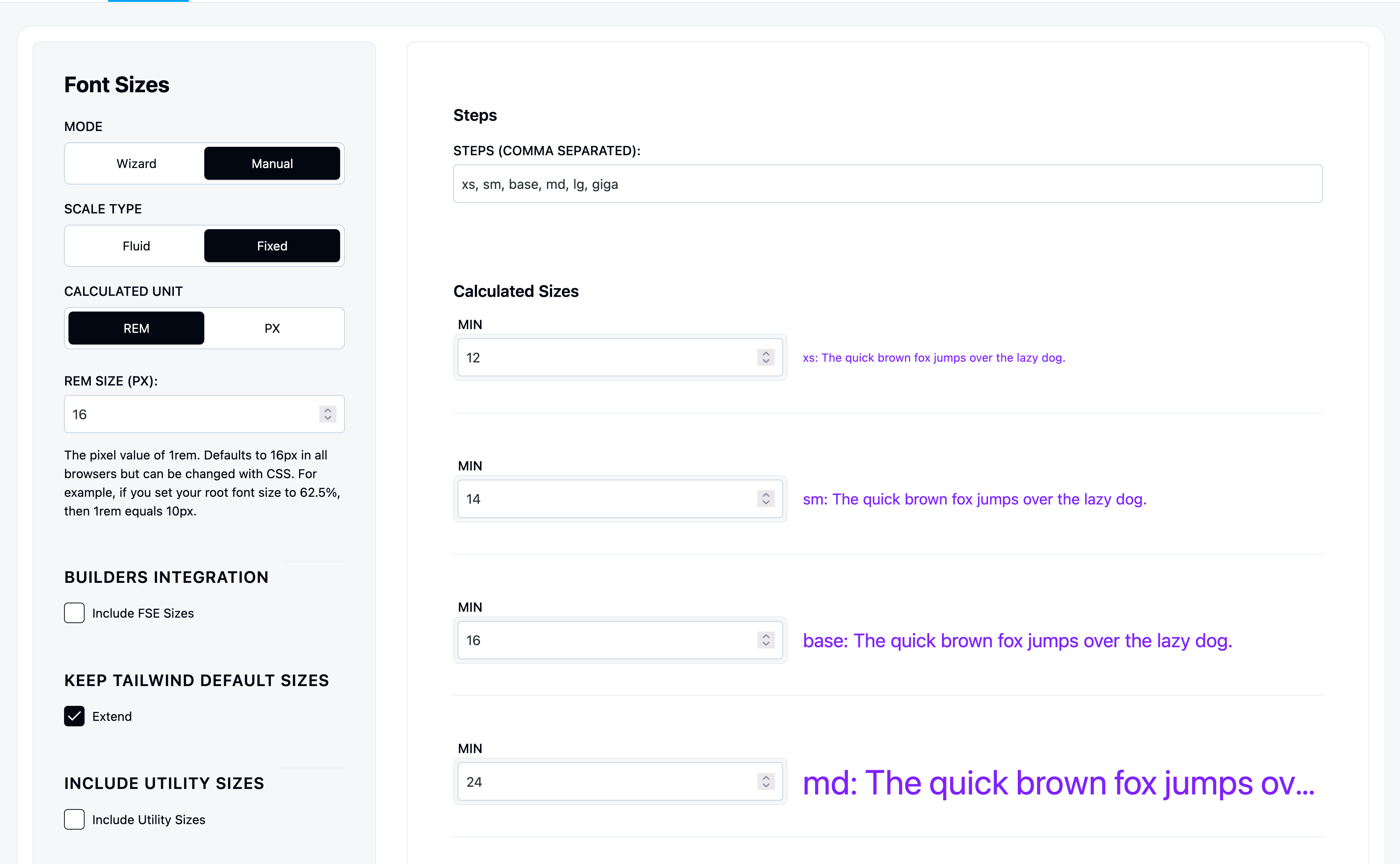
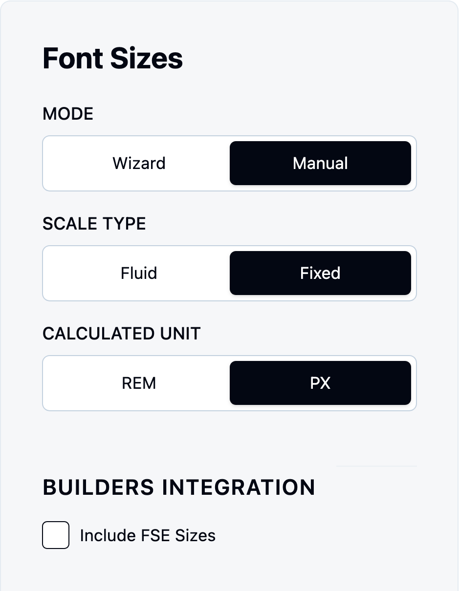
Manual Mode (Per-Step Control)
Define each font size individually with full control.
How Manual Works
Still uses Min & Max for fluid scaling:
- Set screen sizes (min/max viewport)
- Add each size step
- Set min/max value per step
- Name each step
Example:
Screen: 375px → 1440px

Step 1: body
  Min: 16px (at 375px)
  Max: 18px (at 1440px)

Step 2: heading
  Min: 24px (at 375px)
  Max: 32px (at 1440px)

Step 3: display
  Min: 36px (at 375px)
  Max: 48px (at 1440px)
Steps in Manual Mode
Add steps as comma-separated names:
Input: body, heading, display, hero
Creates 4 steps you configure individually.
Result:
@theme {
  --text-body: clamp(1rem, 0.944rem + 0.281vw, 1.125rem);
  --text-heading: clamp(1.5rem, 1.313rem + 0.938vw, 2rem);
  --text-display: clamp(2.25rem, 1.969rem + 1.406vw, 3rem);
  --text-hero: clamp(3rem, 2.438rem + 2.813vw, 4.5rem);
}
Fluid vs Fixed
Fluid (Default)
How it works:
- Set Min value (size at smallest viewport)
- Set Max value (size at largest viewport)
- Uses
clamp()for smooth scaling
Example:
–text-base: clamp(1rem, 0.944rem + 0.281vw, 1.125rem); /* 16px at 375px → 18px at 1440px */
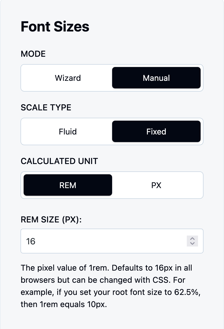
Fixed
How it works:
- Set one value only
- Same size on all screens
- No viewport scaling
Toggle: “Fixed Sizes” → ON
Example:
--text-base: 1rem;  /* Always 16px */
--text-lg: 1.25rem; /* Always 20px */
Pixels vs Rems
Why We Use This System
The problem: Figma and design tools use pixels, not rems.
The solution:
- You input sizes in pixels (matches Figma)
- We convert to rems in output (accessibility)
- No manual conversion needed
Pixels (Default)
Input: 16px, 24px, 32px Output: Converted to rems (1rem, 1.5rem, 2rem)
Why:
- Matches design tools (Figma, Sketch)
- No mental math converting px to rem
- We handle the conversion automatically
Conversion: Based on browser default (16px = 1rem)
Rems
Input: 1rem, 1.5rem, 2rem Output: Stays as rems
Use when: You prefer working directly in rems
Accessibility: Rems respect user’s browser font size setting.
Extend Defaults
Add more sizes beyond your custom scale.
Include Builder Sizes
Import font sizes from your page builder:
- Click “Builder Integrations”
- Select builder (Gutenberg/Bricks/Oxygen)
- Click “Fetch Font Sizes” → “Import”
Result: Builder sizes available everywhere as Tailwind utilities
Use case: You’ve already designed in Bricks, now use those sizes everywhere.
Include Utility Sizes
Click “Add Utility Sizes” → Adds:
inherit– Inherits from parentcurrent– Uses currentColor
Use cases:
Inherits parent size# Uses current font size
Extend vs Replace Tailwind Defaults
Extend (Default): Your sizes + Tailwind defaults Replace: Only your custom sizes
Toggle: Settings tab → “Extend Font Sizes” → OFF
Why replace?
- ✅ No bloat in autocomplete
- ✅ Enforce design system
- ✅ Cleaner output
When replace is active:
@theme {
  --text-*: initial;  /* Remove all Tailwind defaults */
  --text-base: clamp(...);  /* Only your sizes */
  --text-lg: clamp(...);
}