Radio buttons for selecting a single option with visual presentation.
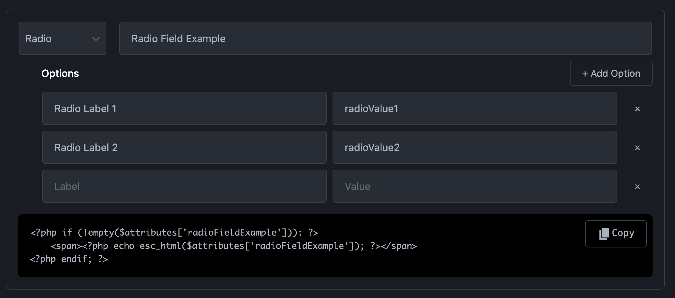
The Radio field displays a list of options as radio buttons, where users can select only one choice. Unlike the Select dropdown, radio buttons show all options at once, making them better when you want users to see all choices without clicking. This is ideal when you have 2-5 options that should be visually compared before selection. The field stores a single value as a string, similar to Select.
Preview in Attributes Manager
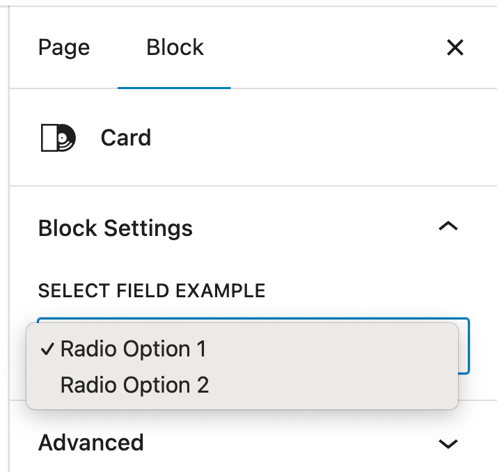
Radio field. Preview in Gutenberg Editor
Technical Information:
| Property | Value |
|---|---|
| Gutenberg UI | Radio button group |
| Data Type | `string` (selected value) |
| Selection | **Single selection only** (returns one value) |
| Returns | Array with one selected value |
| Default Value | First option value or `""` |
| Requires | Options list (label + value pairs) |
| Best For | Single choice from 2-5 options |
| Common Uses | Layout variants, style options, size selection |
| Difference from Select | Shows all options at once (no dropdown) |
| Configuration | Add options with Label (shown to user) and Value (used in code) |