One of the biggest challenges when using a framework is knowing what to do when it doesn’t quite cover everything you need. Tailwind is built to be flexible and customizable from the start, so you can adapt it to fit any project without feeling constrained.
CSS
Using CSS and @layer
When you need to add truly custom CSS rules to a Tailwind project, the easiest approach is to just add the custom CSS to your stylesheet:
@tailwind base;
@tailwind components;
@tailwind utilities;

.my-custom-style {
  /* ... */
}
For more power, you can also use the @layer directive to add styles to Tailwind’s base, components, and utilities layers:
@tailwind base;
@tailwind components;
@tailwind utilities;

@layer components {
  .my-custom-style {
    /* ... */
  }
}
The @layer directive helps you control declaration order by automatically relocating your styles to the corresponding @tailwind directive, and also enables features like modifiers and tree-shaking for your own custom CSS.
Basic example of
If you just want to set some defaults for the page (like the text color, background color, or font family), the easiest option is just adding some classes to the html or body elements.
If you want to add your own default base styles for specific HTML elements, use the @layer directive to add those styles to Tailwind’s base layer:
@tailwind base;
@tailwind components;
@tailwind utilities;

@layer base {
  h1 {
    @apply text-2xl;
  }
  h2 {
    @apply text-xl;
  }
  /* ... */
}
Adding component classes
Use the components layer for any more complicated classes you want to add to your project that you’d still like to be able to override with utility classes.
Traditionally these would be classes like card, btn, badge — that kind of thing.
@tailwind base;
@tailwind components;
@tailwind utilities;

@layer components {
  .card {
    background-color: theme('colors.white');
    border-radius: theme('borderRadius.lg');
    padding: theme('spacing.6');
    box-shadow: theme('boxShadow.xl');
  }
  /* ... */
}
The components layer is also a good place to put custom styles for any third-party components you’re using:
CSS Nesting
By the default we will allow you white class inside class if you need to scope it or make higher selector.
html {
  .card {
    @apply p-2;
  }
}

.card {

    .title{
      /* ... */
    }

    .thumb{
      /* ... */
    }
}
This like example bellow will not work as this is not nesting. This is pure SCSS with preprocessor.
.card {
  &__title{
    /* ... */
  }
}
CSS / SCSS Options
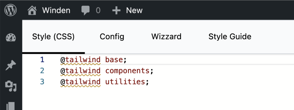
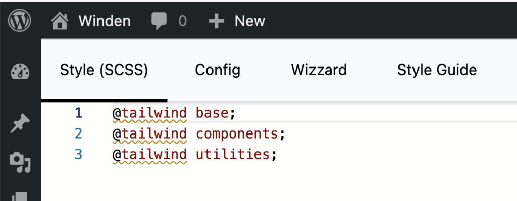
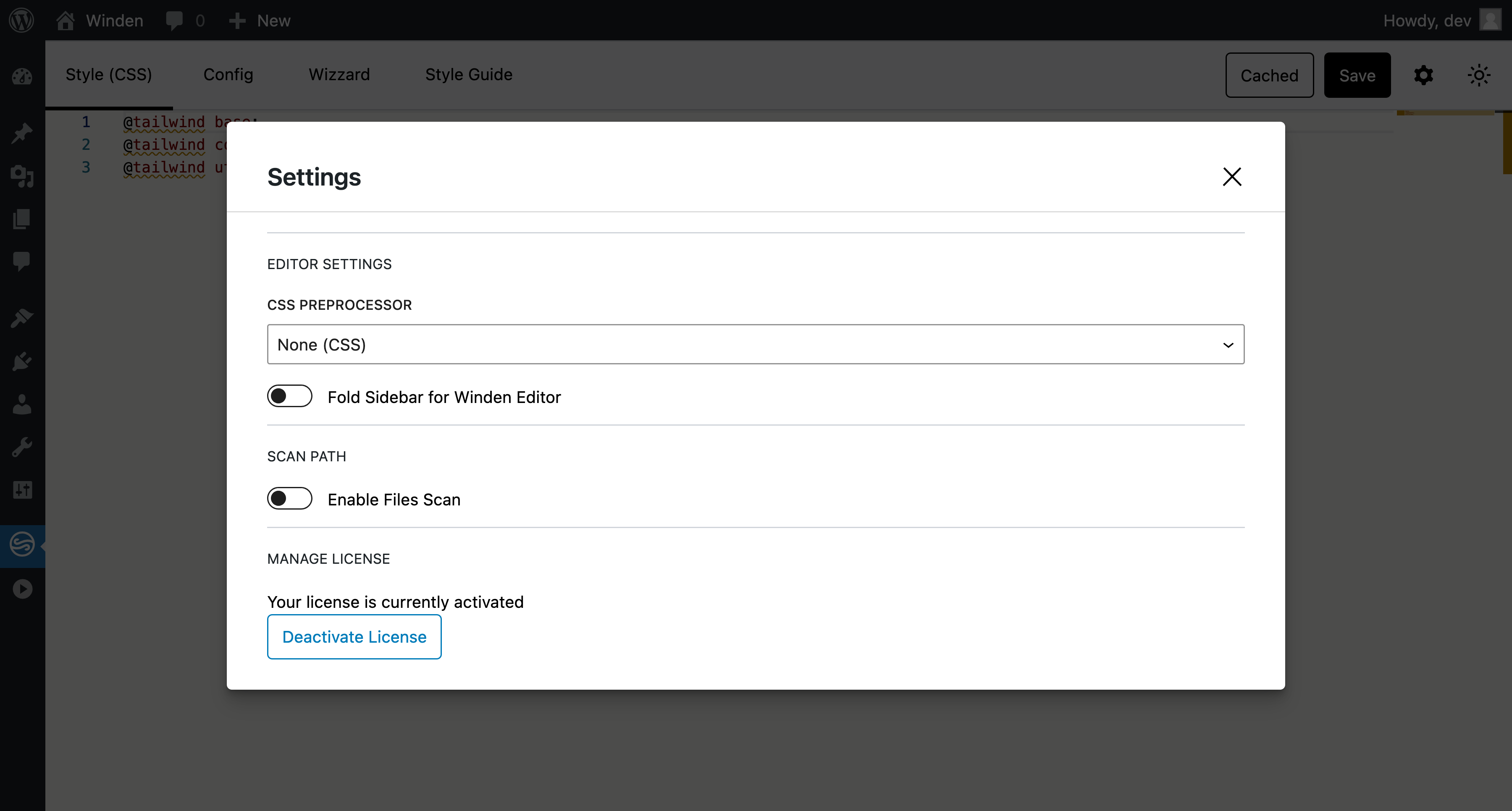
Style tab have indicator what preprocesser is used. If nothing is user we will use CSS with Nesting feature. If you open:
- Open Setting by pressing Corg icon
- Change CSS Preprocessor from CSS to SCSS
Tab will change indicator to Style (SCSS)


SCSS
Allowing SCSS inside tailwind have many advantages but also comes with limitations
Benefits
Custom Mixins and Variables: SCSS allows you to create mixins and variables, which can help simplify repetitive Tailwind classes. For instance, if you frequently apply similar padding or margin classes, you can create a mixin for it in SCSS. This reduces the need to repeat the same Tailwind classes, keeping your HTML cleaner.
Important
You can not use “!” or plain Important inside SCSS as preprocessor will trow an error
❌ Incorrect
.alert {
  @apply !bg-red-500;
}
SCSS does not understand !
❌ Won’t work, Sass complains about !important
.alert {
  @apply bg-red-500 !important;
}
✅ Use interpolation as a workaround
.alert {
  @apply bg-red-500 #{!important};
}
Additional problem with !important is that all values will be important
.alert {
  @apply bg-red-500 p-2 m-4 #{!important};
}

/* RENDER: */

.alert{
  background-color: #ef4444 !important;
  margin: 1rem !important;
  padding: 0.5rem !important;
}
And even this looks correct now it will be hard to add utility class after this and overwrite it as this is important already.
Theme
Use the theme() function to access your Tailwind config values using dot notation.
.content-area {
  height: calc(100vh - theme(spacing.12));
}
If you need to access a value that contains a dot (like the 2.5 value in the spacing scale), you can use square bracket notation:
.content-area {
  height: calc(100vh - theme(spacing[2.5]));
}
Since Tailwind uses a nested object syntax to define its default color palette, make sure to use dot notation to access the nested colors.
❌ Don’t use the dash syntax when accessing nested color values
.btn-blue {
  background-color: theme(colors.blue-500);
}
✅ Use dot notation to access nested color values
.btn-blue {
  background-color: theme(colors.blue.500);
}